

Dashboards
Desktop SCADA canvases and mobile home dashboards with live cards and controls
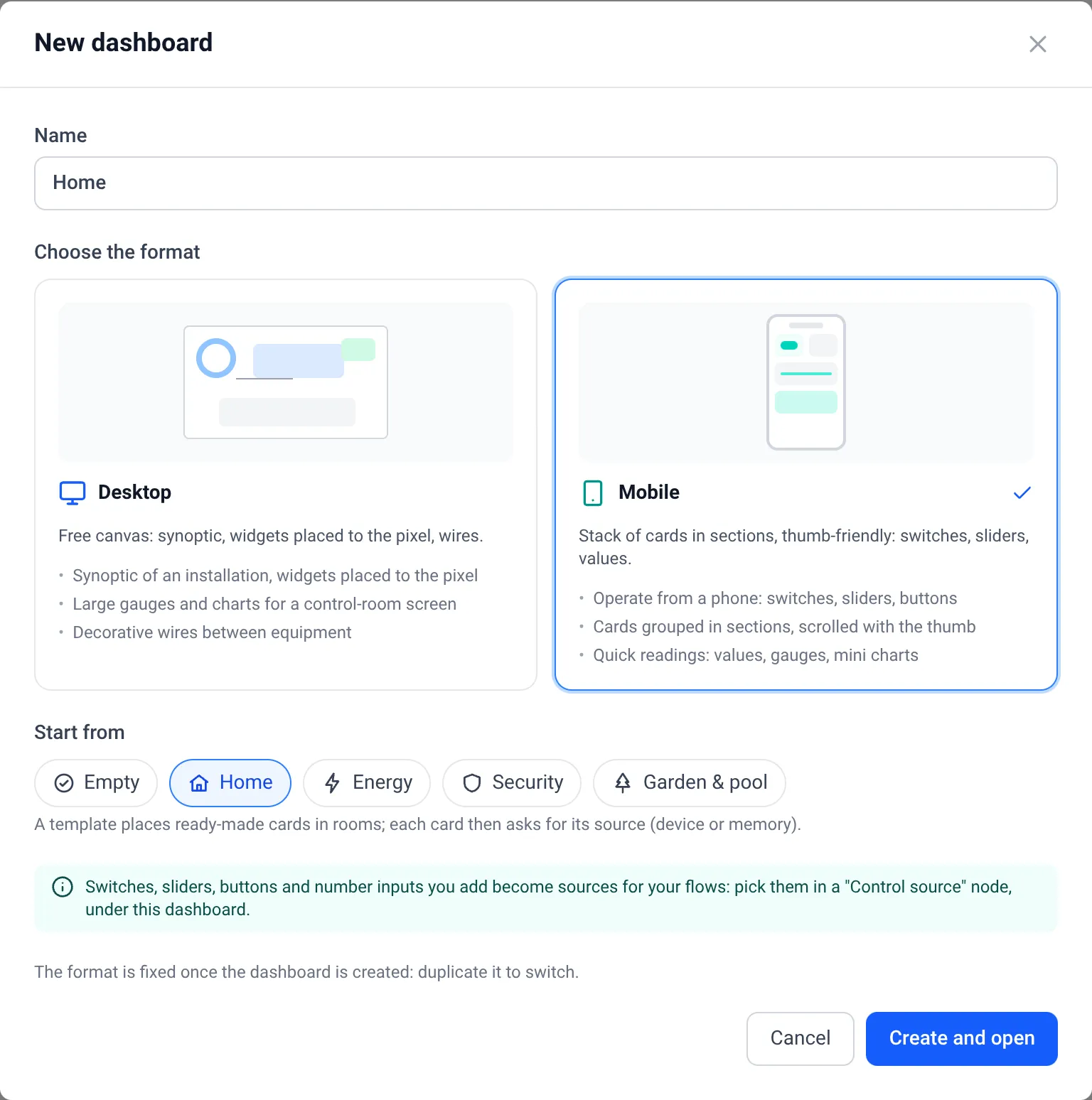
A dashboard comes in one of two formats, chosen when you create it:
| Format | Layout | Made for |
|---|---|---|
| Desktop | Free canvas, pixel positioning, wires between shapes | Control rooms, synoptics, P&ID process lines |
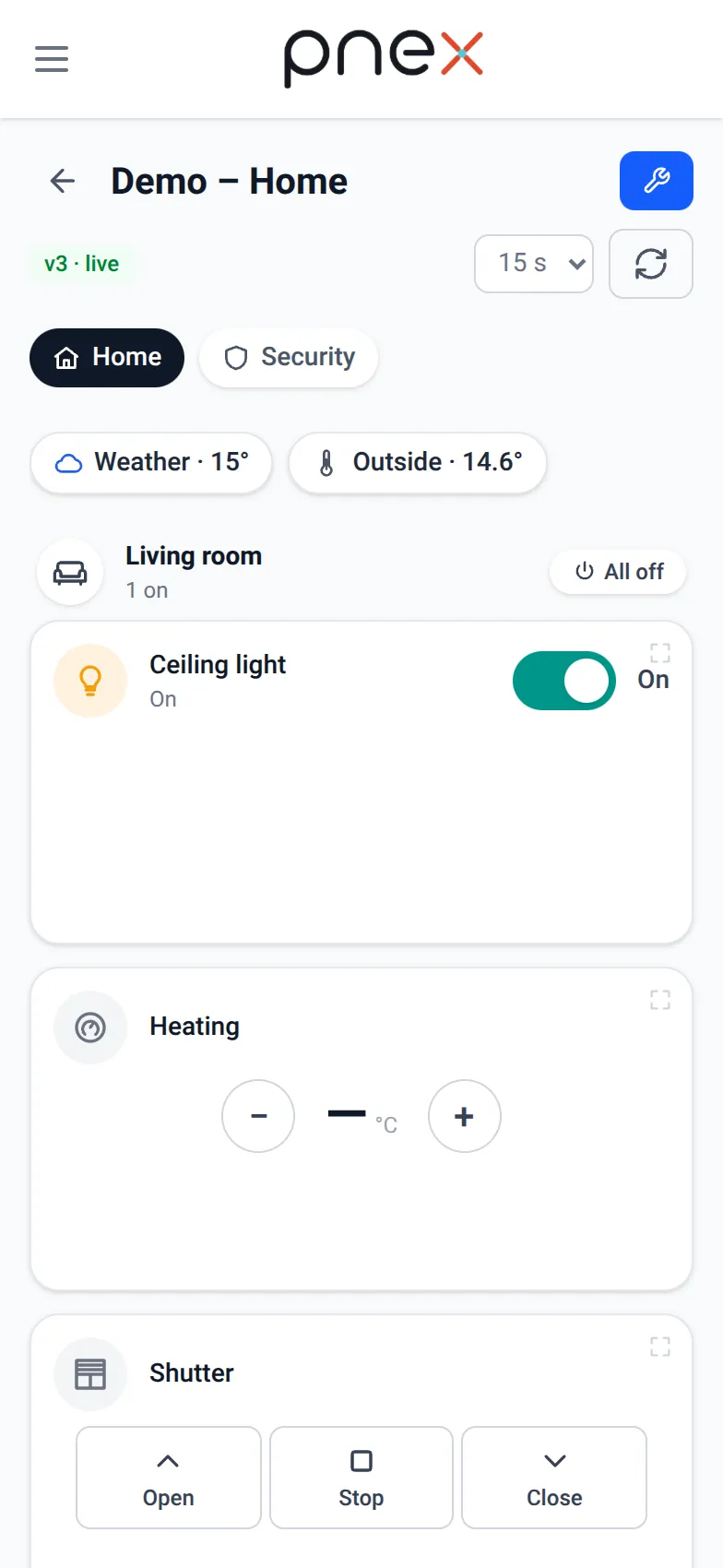
| Mobile | A stack of cards in sections and pages, two columns on a phone | Home automation, quick status on the go, the phone app |
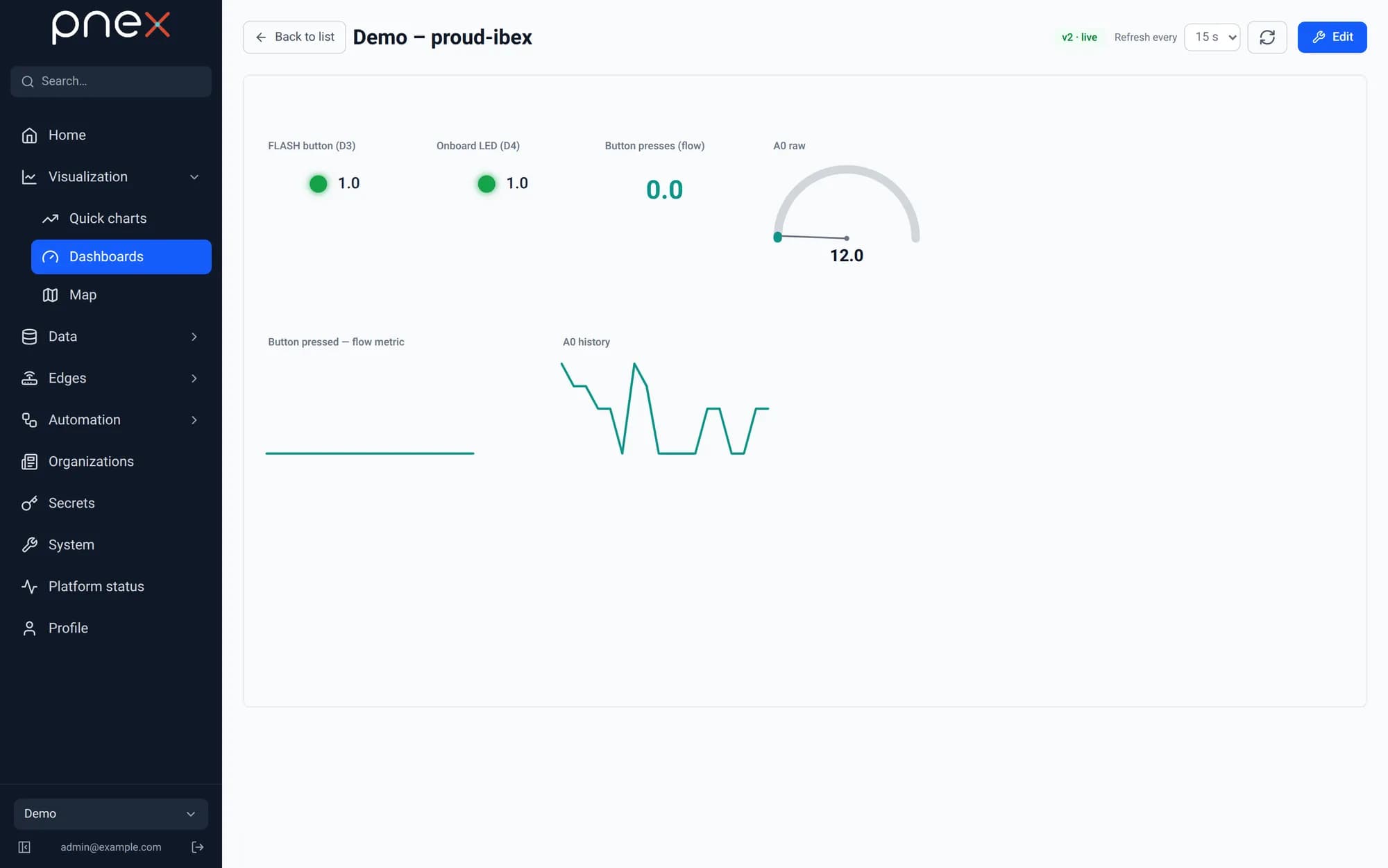
Both are edited with undo/redo and a versioned save: the saved version is a pointer, publishing is instant, and editing never disturbs the live view. The format is fixed once the dashboard exists: duplicate it to switch.
Dashboards read (device telemetry, memory values written by flows, mini charts). Switches, sliders and the other controls never drive a device directly: each one becomes an org control that a deployed flow listens to. See Controls.
Creating a dashboard
Visualization → Dashboards → New dashboard, type a name, choose Desktop or Mobile, then Create and open. A mobile dashboard can Start from a template:
| Template | What it lays out |
|---|---|
| Empty | One "General" section |
| Home | Weather and outside chips; Living room, Kitchen, Bedroom rooms; Scenes (Good night, Leaving home); a Security page (alarm, front door, doors & windows) |
| Energy | House power chip, energy flow, electricity / water / gas meters, washing machine and heat pump |
| Security | Alarm, front door lock, gate and garage, smoke, water leak and window detectors |
| Garden & pool | Weather chip, two watering zones, pool water temperature, pool pump and light |
Template cards arrive without sources: each shows To configure: pick its source in the editor until you pick a device metric or a memory key in the inspector.
The palette
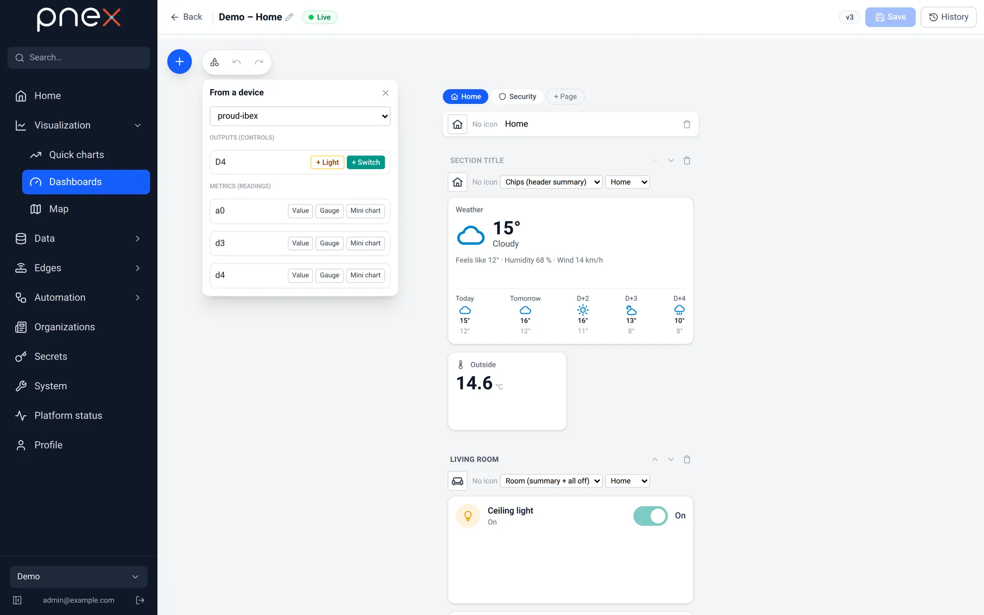
The + palette is grouped: Start (From a device), Home, Sensors, Energy, Controls, Values & states, Charts, Industrial. Cards of the Home, Sensors and Energy groups are described in Home cards.
From a device is the fastest start: pick a device, and its output pins are offered as + Switch, + Slider or + Light (dimmable on a PWM pin), its metrics as readings or as a Suggested home card guessed from the metric name (temperature, CO₂, power, energy, door, window, motion, smoke, leak).
Mobile composer
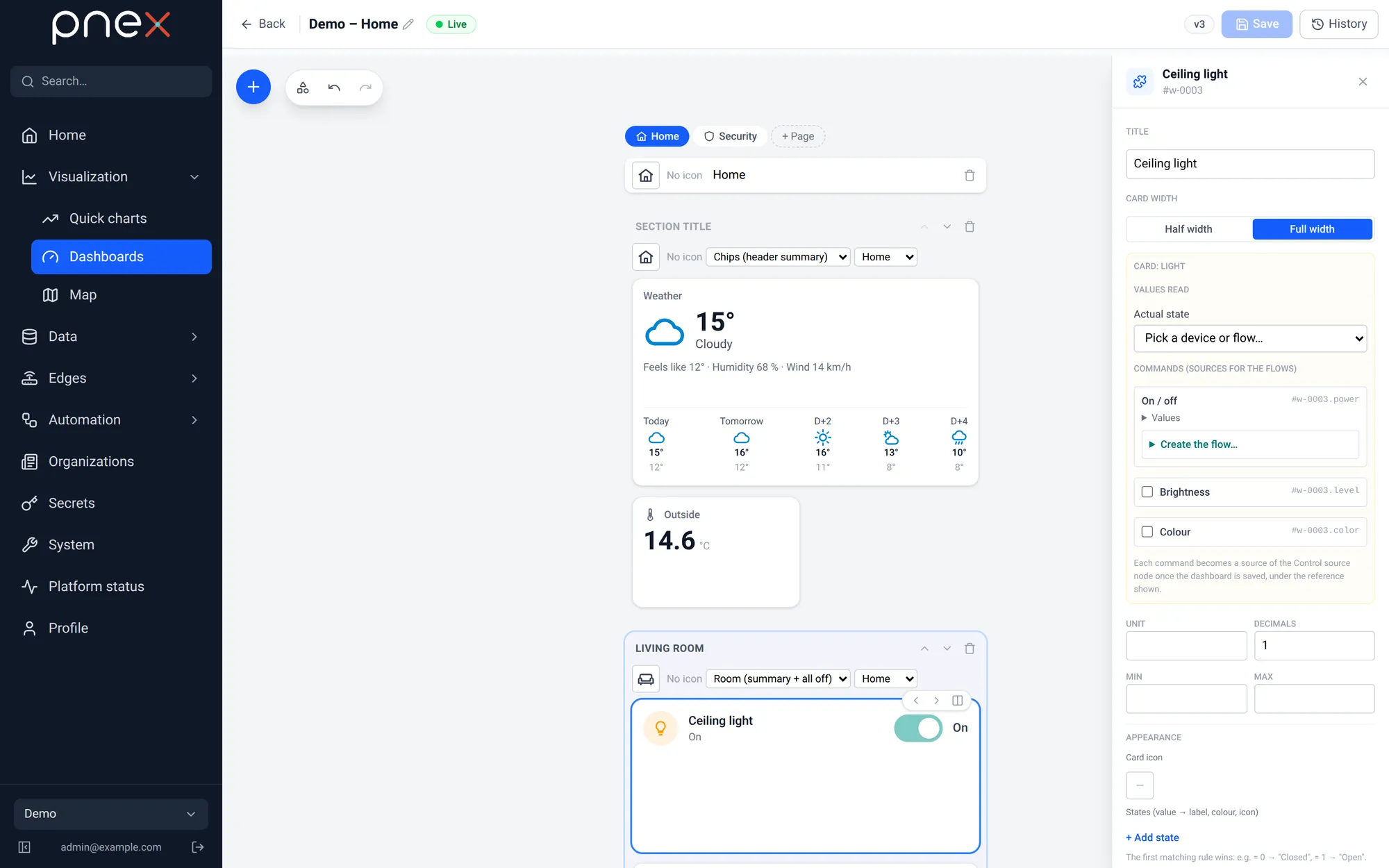
A mobile dashboard is made of pages (tabs in the live view, + Page), each holding sections (+ Add a section). A section has a title and a style:
- Cards: a plain grid of cards.
- Room (summary + all off): the header shows the mean temperature, how many things are on, the total power, and an All off button that switches off every light, fan and switch of the room after a confirmation.
- Chips (header summary): a row of compact chips, ideal for the top of a page (weather, outside temperature, house power).
Each card is Half width or Full width: two columns on a phone, four on a tablet, six on a large screen. Cards and sections move up and down; deleting a section moves its cards to the previous one.
Appearance
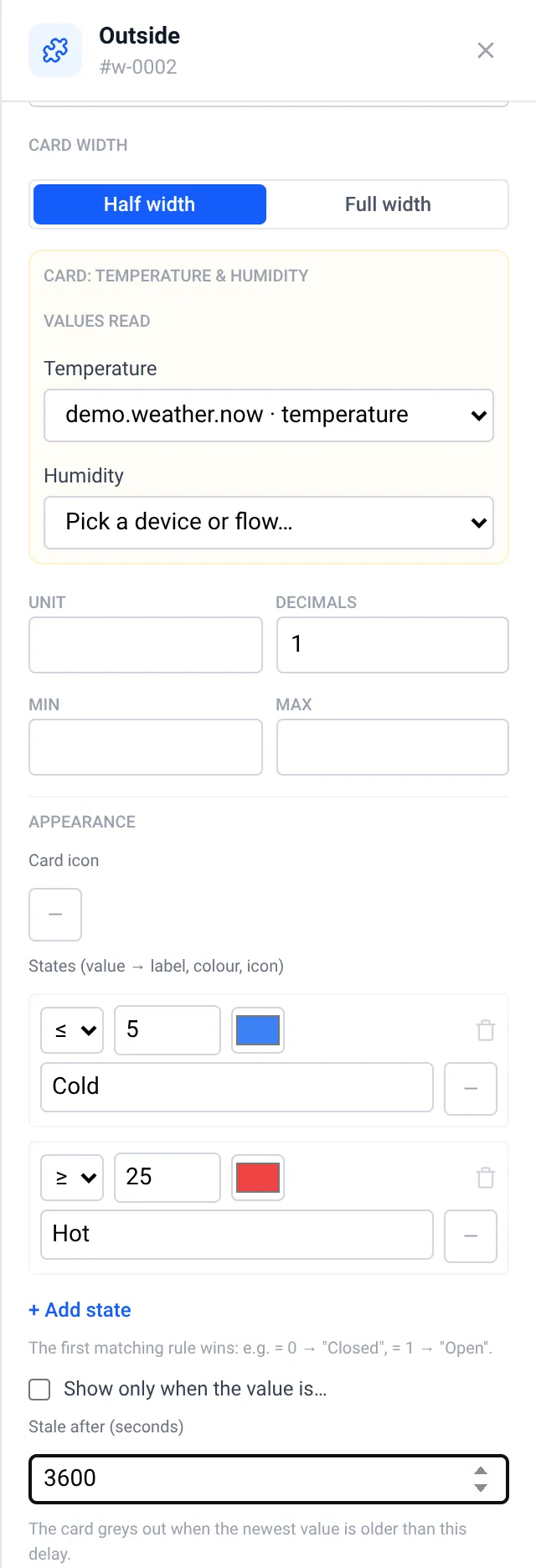
The Appearance panel of a card sets:
- Card icon, picked from a searchable catalog of about a hundred original home icons.
- Colour thresholds: the value colour follows the highest threshold reached.
- States (value → label, colour, icon): for example
1 → Open, orange, door-open. The first matching rule wins. - Stale after (seconds): when no value arrived in time the card greys out and shows No recent data.
- Show only when the value is… (mobile): a conditional card, hidden while its first source does not match. Without data the card stays visible.
Live view
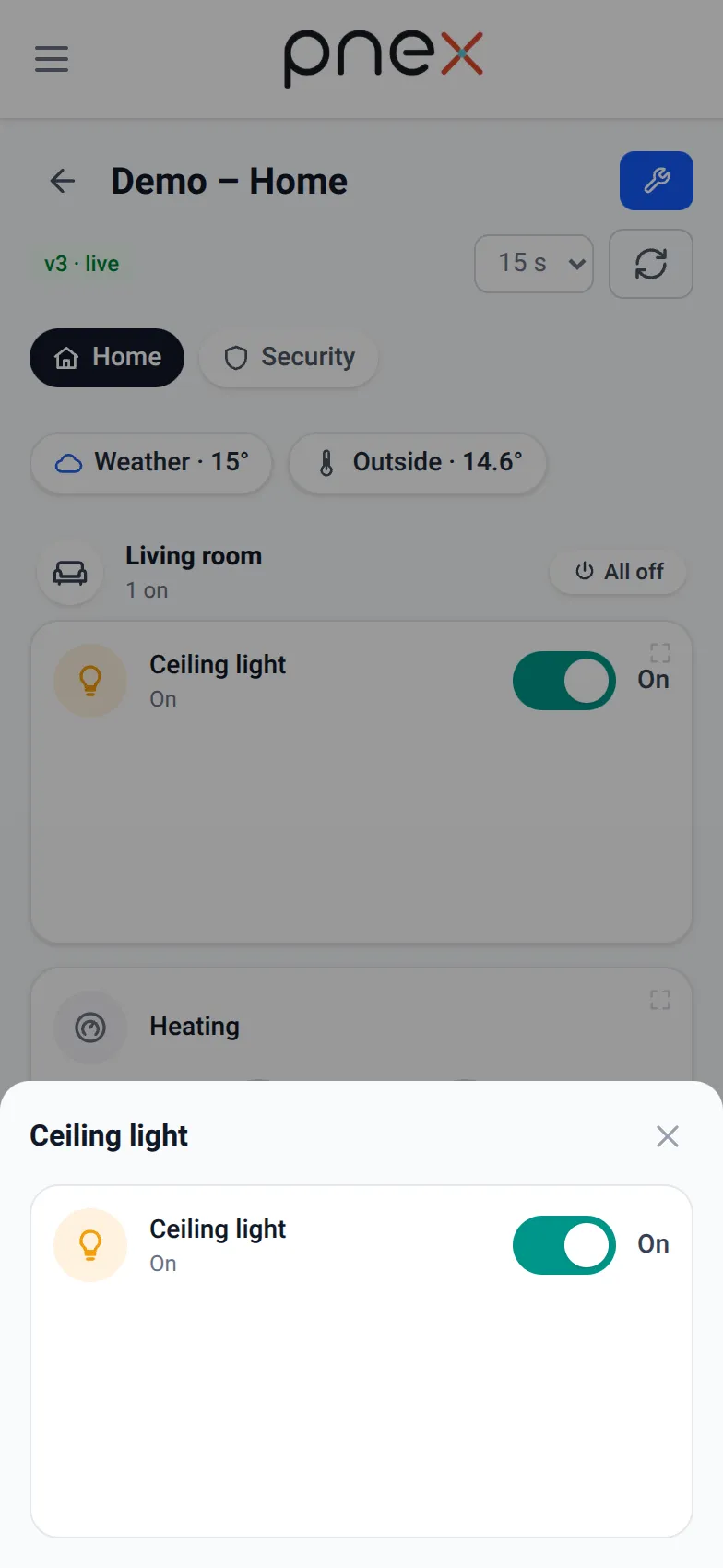
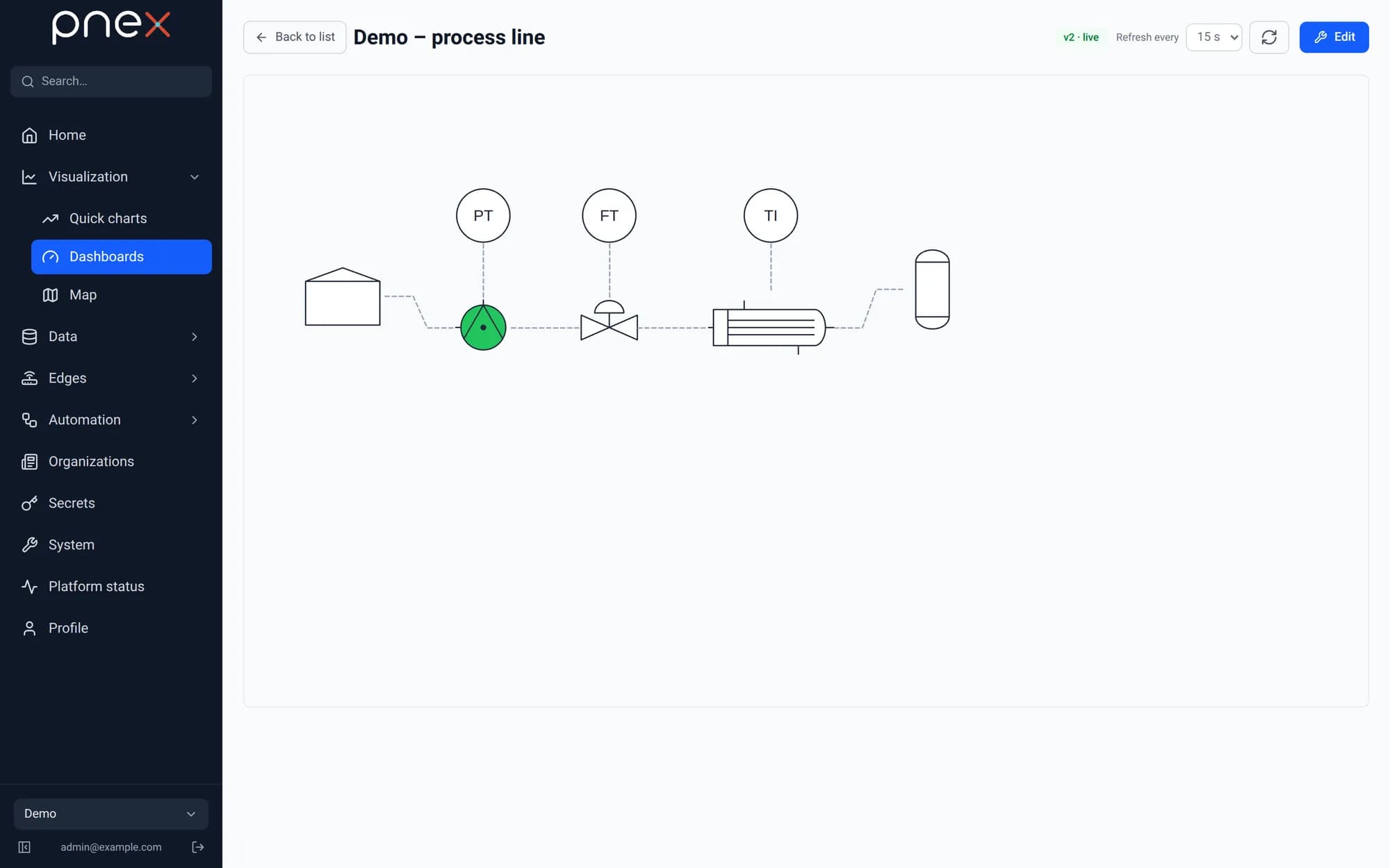
The live view refreshes every widget within its own time window (1 to 60 s on a desktop canvas). On mobile, page tabs sit at the top, rooms show their summary, and each card has a Details and history button that opens a bottom sheet with the card and its last 24 hours.
Desktop widgets
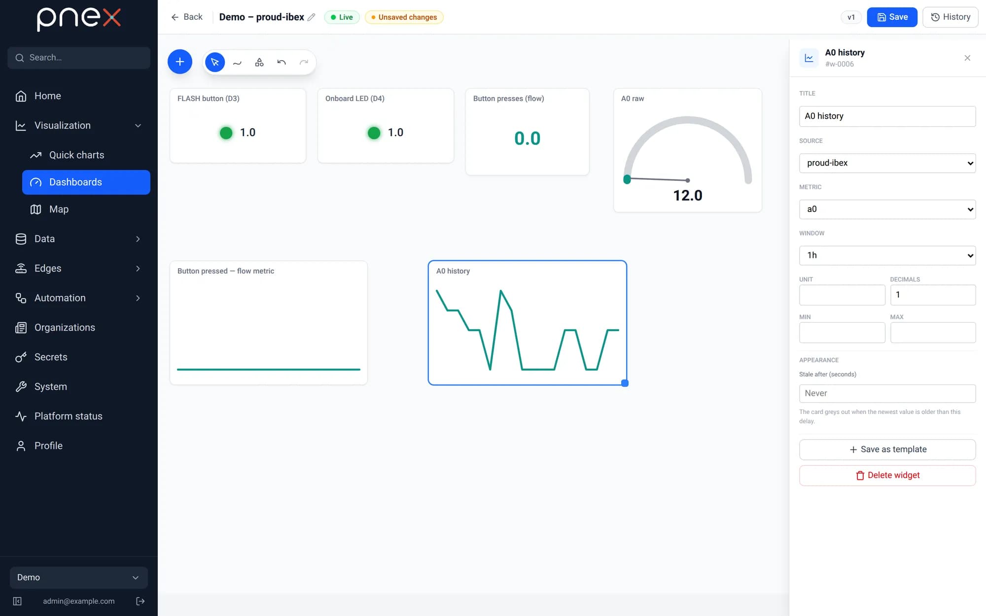
On a desktop canvas, instrument widgets are fed by a batched telemetry endpoint: gauge with thresholds, value tile, mini chart, indicator LED, text, and a thermodynamic diagram. Pick one from the + palette, then choose its source (a device, a flow metric or a memory key) in the inspector.
Process symbols
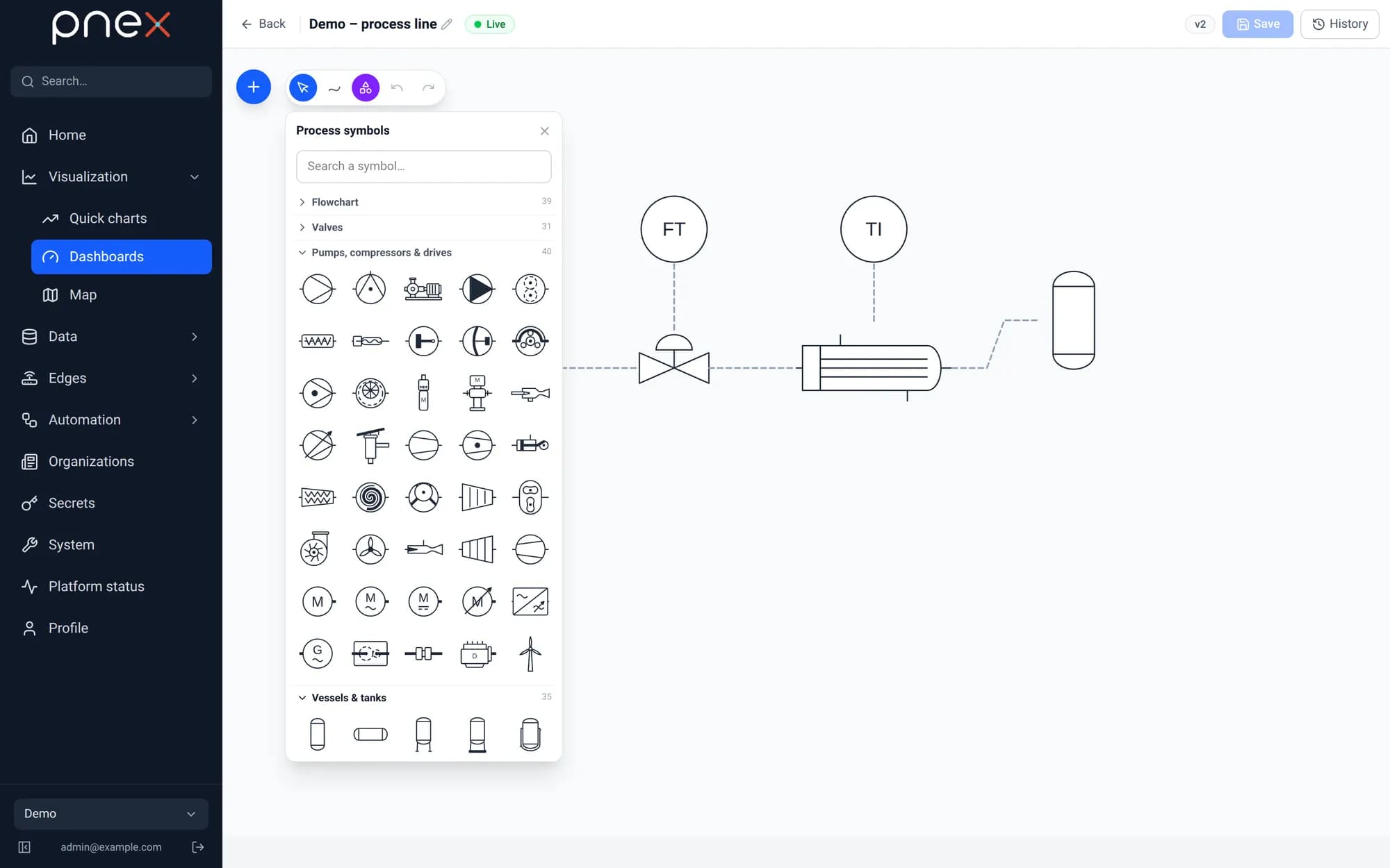
The Process symbols library turns a dashboard into a synoptic view: more than 300 original P&ID and flowchart shapes, drawn after the usual conventions (ISO 10628 / ISA 5.1 for process, ISO 5807 for flowcharts), in ten searchable categories:
| Category | Examples |
|---|---|
| Flowchart | process, decision, terminator, document, database |
| Valves | gate, globe, ball, butterfly, check, control, solenoid, relief |
| Pumps, compressors & drives | centrifugal, screw, diaphragm, metering pumps; compressors, fans, motors, VFD |
| Vessels & tanks | vertical and horizontal vessels, cone-roof tank, silo, column, stirred reactor |
| Heat transfer | shell-and-tube, plate exchanger, cooling tower, boiler, heat pump, air handling unit |
| Instrumentation | TI, PT, FT, LT bubbles, controllers, flowmeters, pressure gauge |
| Piping | flanges, reducers, strainers, steam trap, sight glass, rupture disc |
| Agitators & mixers | propeller, Rushton, anchor agitators; static inline mixer, ribbon blender |
| Filtration & separation | cartridge filter, filter press, cyclone, decanter, scrubber, dryers |
| Solids handling & transport | belt and screw conveyors, bucket elevator, star feeder, mills, trucks |
Open the library from the tool pill (or the + palette), search a symbol by name, and click it to drop it on the canvas. Symbols are drawings, not cards: resize them, rotate, mirror or stretch them, and change line and fill colours in the inspector. The wire tool links their anchors to draw the process lines.
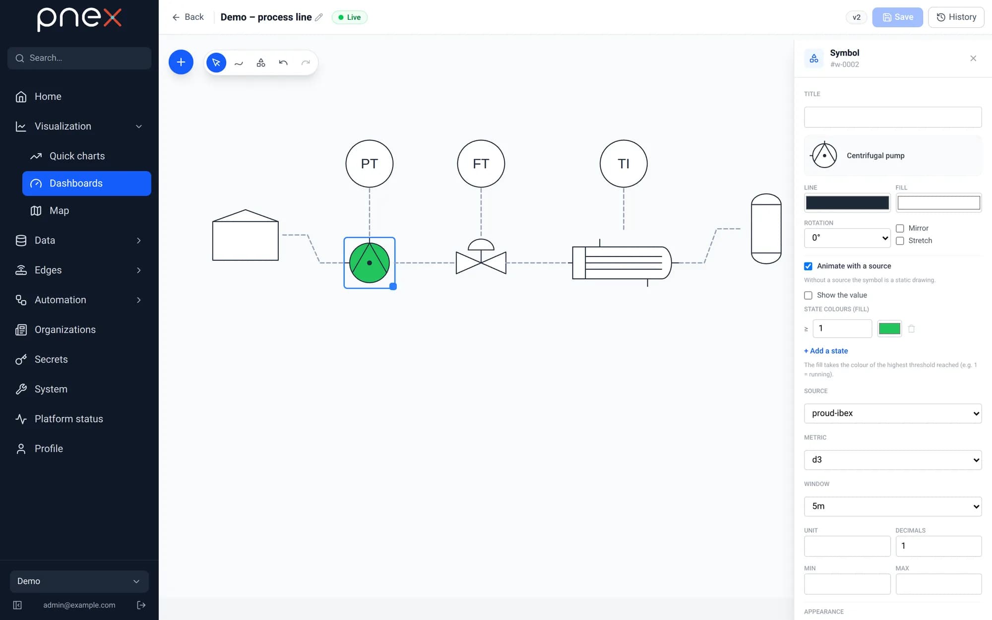
A symbol can also be animated by a source: tick Animate with a source, pick a
device or flow metric, and add state colours — the fill takes the colour of the
highest threshold reached (for example ≥ 1 green = pump running). Show the value
prints the live value next to the shape.
Widget templates
An org-scoped widget template library: drag a template onto the canvas and it drops as a snapshot, ready to edit.